A more actionable Connections UI
IBM Connections is a two headed beast: on one hand it is a set of rich APIs offering different services (Status, Blogs, Wiki, Text, Activities etc) on the other it provides a set of UIs on top of this APIs. Yes, not one, but a set: Browser, Android, iShiny™ and IBM Notes. I'm a big fan of the APIs. After all they stand for IBM's commitment to open standards and are build with XML, REST, ATOM and ActivityStreams compliant to the OpenSocial specifications.
I'm not so sure about the UIs, especially the browser UI. While it is fiercely backward compatible in its browser support, it doesn't take advantage of modern browser capabilities (a all to common Catch 22: the general expectation is software to be bleeding edge but to work on all runtimes. Only slowly the idea takes hold "work on all runtimes" doesn't necessarily mean "is the same" and software embraces graceful degradation instead of the least common denominator. We might see that in Connections some time in the future too.
Anyway, the API concept allows you to create your own UI without running foul of breaking the existing application. So I doodled around with my favourite mockup tool how I would enhance the existing UI:

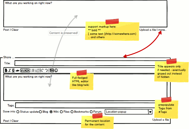
Following the concept of progressive disclosure the entry box in the status update could be used to create any type of entry. It is quite paradoxical, that now I need to decide where (Status, Blog, Wiki, Activity etc.) to say something before I can say it. The what and where need to be more independent. By providing a single entry box this is absolutely possible.
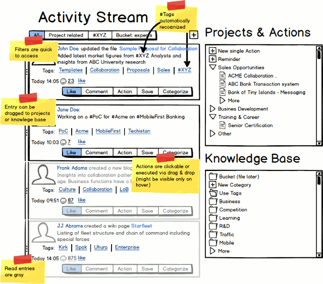
On the receiving end the "River of News" (a.k.a. Activity Stream) would become much more actionable:

Different interaction models would support different work styles: drag & drop (swipe on touch devices), button clicks or shortcut keys will allow to act on items that arrive in the stream: turn it into a (project linked) action, keep it in a personal, but accessible, knowledge base, comment and like (as we have it now) and flag the unread entries (like in the inbox or an RSS reader). Currently a user has little control over the activity stream and thus a sense of dis-empowernment hinders broader/faster adoption (better offline/sync support wouldn't harm either).
How would you design your Action UI™?
I'm not so sure about the UIs, especially the browser UI. While it is fiercely backward compatible in its browser support, it doesn't take advantage of modern browser capabilities (a all to common Catch 22: the general expectation is software to be bleeding edge but to work on all runtimes. Only slowly the idea takes hold "work on all runtimes" doesn't necessarily mean "is the same" and software embraces graceful degradation instead of the least common denominator. We might see that in Connections some time in the future too.
Anyway, the API concept allows you to create your own UI without running foul of breaking the existing application. So I doodled around with my favourite mockup tool how I would enhance the existing UI:

Following the concept of progressive disclosure the entry box in the status update could be used to create any type of entry. It is quite paradoxical, that now I need to decide where (Status, Blog, Wiki, Activity etc.) to say something before I can say it. The what and where need to be more independent. By providing a single entry box this is absolutely possible.
On the receiving end the "River of News" (a.k.a. Activity Stream) would become much more actionable:

Different interaction models would support different work styles: drag & drop (swipe on touch devices), button clicks or shortcut keys will allow to act on items that arrive in the stream: turn it into a (project linked) action, keep it in a personal, but accessible, knowledge base, comment and like (as we have it now) and flag the unread entries (like in the inbox or an RSS reader). Currently a user has little control over the activity stream and thus a sense of dis-empowernment hinders broader/faster adoption (better offline/sync support wouldn't harm either).
How would you design your Action UI™?
Posted by Stephan H Wissel on 19 April 2013 | Comments (0) | categories: IBM IBM - Lotus SocialBusiness