One or two click mobile approvals?

With Mobile First being the parole of the day more emphasis needs to be spend creating good mobile user interfaces. As much as the web is not print, mobile is not just a small desktop. Nevertheless we apply lessons learned from desktop interfaces to mobile devices and learn as we go along. Especially corporate development managers dream of write once, run everywhere (while we know that the best achievable case is write once, test everywhere). Some of the critical differences:
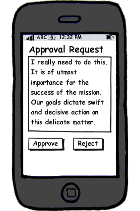
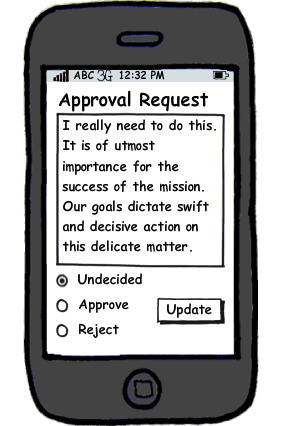
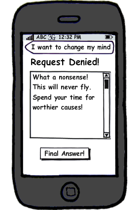
Is the typical pattern with an Approve and a Reject button the right approach for mobile? Surly it would feature one click decisions, a god sent for time plagued managers, of course only until you hit the wrong button due to a road bump. So alternate approaches are needed. One as pictured above would be to have a radio button (or its mobile equivalent) and the button. Another possibility would be to switch from the request screen to one that lets the decision maker add a comment and finalise the answer:
Still the challenge remains what contextual information to show with a request, but that's a story for another time.
- Your screen is small
- Your pointer is big
- Your network is unpredictable
- You want to swish
- You aim is weak (especially when in a bus, train, plane or ship)
- You rather select than type
- You really want to focus on essentials only
Is the typical pattern with an Approve and a Reject button the right approach for mobile? Surly it would feature one click decisions, a god sent for time plagued managers, of course only until you hit the wrong button due to a road bump. So alternate approaches are needed. One as pictured above would be to have a radio button (or its mobile equivalent) and the button. Another possibility would be to switch from the request screen to one that lets the decision maker add a comment and finalise the answer:
Still the challenge remains what contextual information to show with a request, but that's a story for another time.
Posted by Stephan H Wissel on 05 October 2011 | Comments (0) | categories: XPages