Documenting Project Progress

Software projects are not started and completed in a single day (well except certain voting applications for certain design partners), so you need to track progress. The typical way is to estimate the amount of work, set this at 100% and have a line (or bar) chart that shows the percentage of completion over time. You all have seen those diagrams. But they suck big time. Inevitably popular methods try to live without. So while you work like a mad dog to complete a project your progress line starts looking like on from ER room that triggers the typical "We lost him". All the change requests don't get reflected in the percentage, so you don't seem to progress. But there is a better way!
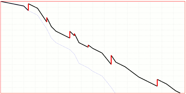
Enter the Burn Chart. In a burn chart you document the "items of work left to do", so you get a line that somewhen hits the x-axis on project completion. When change happens, you simply draw a vertical line up that shows the additional amount of work. You then conveniently can project how the additional work units move the project completion date. I've been playing with Dojo gfx to visualize such a burn chart. I opted to have fat red changes and trajectory projections. With a few finishing touches (will take some days) I have a neat function that can take in a Notes view with 2 values (Units completed, Units added) and show the real time line. I can imagine quite some projects where the progress will look like Sonic the Hedgehog.
Enter the Burn Chart. In a burn chart you document the "items of work left to do", so you get a line that somewhen hits the x-axis on project completion. When change happens, you simply draw a vertical line up that shows the additional amount of work. You then conveniently can project how the additional work units move the project completion date. I've been playing with Dojo gfx to visualize such a burn chart. I opted to have fat red changes and trajectory projections. With a few finishing touches (will take some days) I have a neat function that can take in a Notes view with 2 values (Units completed, Units added) and show the real time line. I can imagine quite some projects where the progress will look like Sonic the Hedgehog.
Posted by Stephan H Wissel on 10 November 2008 | Comments (0) | categories: SYWTBADD